


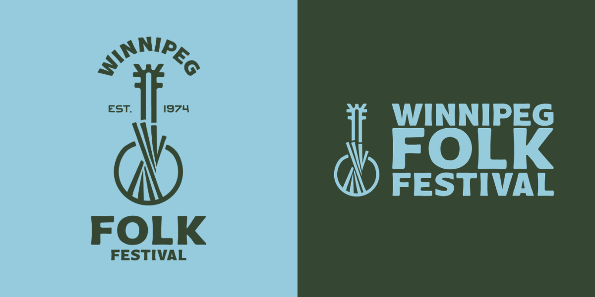
We are so excited to share that the Winnipeg Folk Festival has a new organizational logo and look. Our logo and visual identity are changing, but our mission remains the same–celebrating people and music.
Our new visual identity is rooted in the idea that the Winnipeg Folk Festival is more than a summer event–it’s a gathering place, a community, and a year-round organization with people and music at its core.
To shape and create the new identity, we commissioned Roberta Landreth. Landreth is a JUNO Award-winning graphic designer known for iconic visuals across the music industry and beyond. Since 2021, Roberta has created stunning annual artwork for the Winnipeg Folk Festival that has perfectly captured the nature of the Festival. As a Winnipeg local and long-time folkie, it felt only natural to have her refresh the Winnipeg Folk Festival’s visual identity.
Behind the Logo
As an organization that shares music and fosters community all year long, we wanted to have an image that reflects exactly that. The new logo includes the banjo as a symbol of music while adding an extra element of community: the Festival Tower. The Tower symbolizes bringing people together, aligning well with our commitment to building a community grounded in our values of collaboration, creativity, and inclusiveness. The logo is simple with a handmade quality, giving it a warmth and openness that reflect the character of our organization. Rather than feeling polished or precious, it feels human–something made by people, for people.
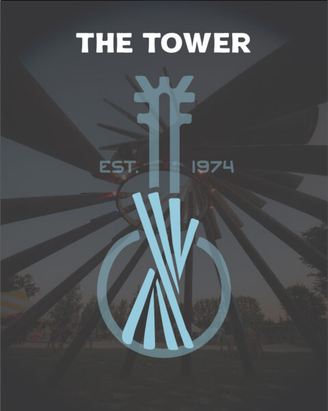
Est. 1974 – Since 1974, the Winnipeg Folk Festival has hosted 51 summer festivals and countless concerts, workshops, and events throughout the city. The longevity of the organization is a testament to the community who has supported the organization and the Festival all these years.
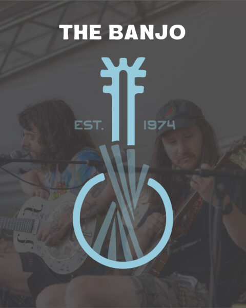
The Banjo – The banjo has been a key part of the Festival’s branding for over 50 years. The banjo is our symbol of music–the reason we gather at Birds Hill Park and create events and concerts for our community year-round.
Festival Tower – At the centre, the banjo strings radiate outward, forming the Festival Tower, which sits at the centre of our Festival Village. The Tower serves as a meeting place, a landmark to guide you, and represents people coming together as a community.
WFF – Creating the headstock of the banjo are the letters WFF, the initials of the Winnipeg Folk Festival. The two Fs facing backwards and forwards are an acknowledgement of the past while also embracing the future.
Typography – Bold, approachable, and slightly imperfect. It has an organic feel that gives the identity a strong presence without losing the handmade spirit that has been part of the Winnipeg Folk Festival from the very beginning.
Colours – The palette pays homage to the nature and beauty of the prairies. The primary colours are Lush Green and Sky Blue, representing the grass and forests and the bright blue summer skies. The secondary colours, Sunshine Yellow, Sunset Red, and Twilight Purple, reflect the kaleidoscope of colours that make up the picture-perfect Manitoba sunsets that are the backdrop to our year-round concert series.
Background
The inaugural Winnipeg Folk Festival was held in 1974 in Birds Hill Provincial Park on Treaty 1 territory and the National Homeland of the Red River Métis, as a one-time celebration to mark Winnipeg’s 100th anniversary. It was a free event and attracted an estimated audience of 22,000 over the three-day weekend.
For more than 5 decades the Winnipeg Folk Festival grew considerably with over 70+ artists playing across 9 stages, attracting 75,000 attendees and over 2500 volunteers each year. The organization has developed beyond the one-weekend in July to a year-round charitable, non-profit arts organization that presents concerts, events, and community outreach programs throughout Winnipeg.
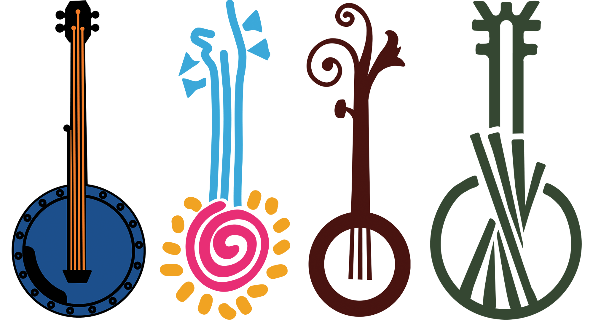
As our organization evolves, so do our logos. Our first logo, created in 1975, was used for nearly two decades. In 1993, a new design featuring a spiral sun banjo was introduced to celebrate our 20th anniversary. In 2011, we revealed a new logo design, alongside a streamlined visual brand that has served us well for the past 15 years. Each logo captured a new chapter for our organization while staying true to our musical and community roots.
As we reflected on the past 52 years and looked towards the future of the Winnipeg Folk Festival, we realized we were ready to refresh our visual identity. Our new logo honours where we came from, reflects who we are today, and embraces where we’re going, all while keeping what is important–people and music.


You must be logged in to post a comment.